The Journey of Designing CBD Product Branding and Packaging
Setting Goals and Making Them Reality
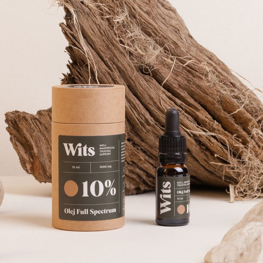
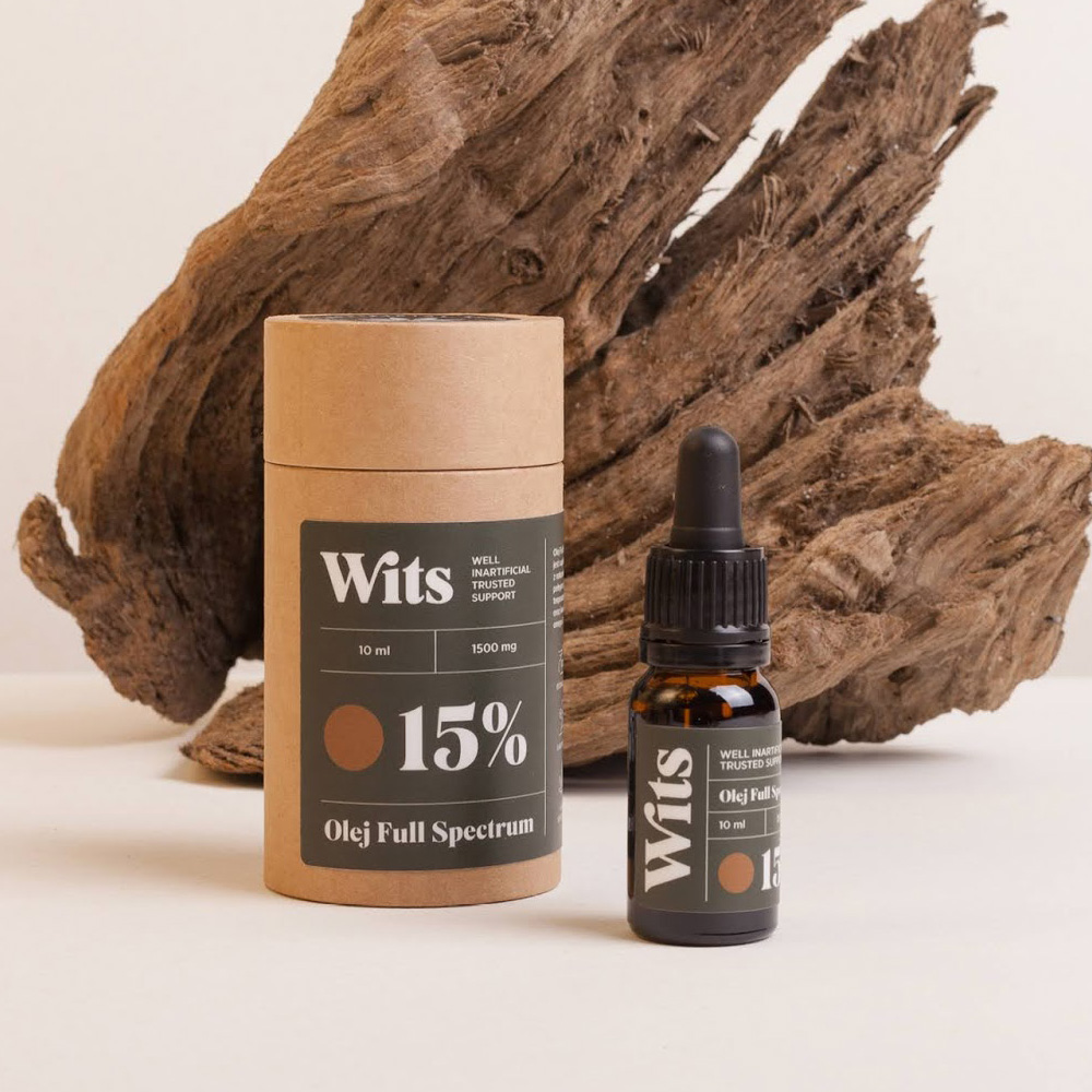
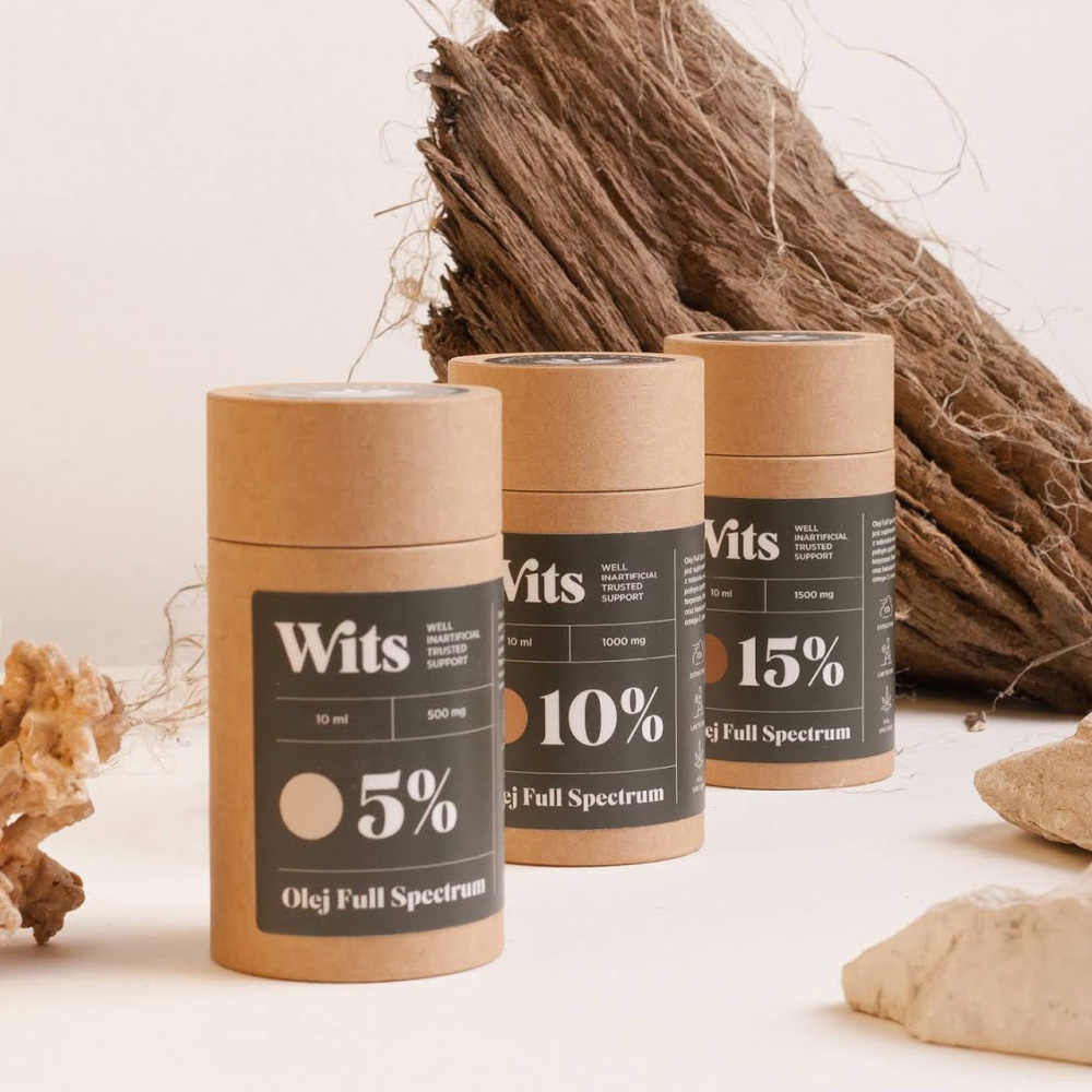
In the realm of design, goals serve as guiding stars, leading us towards creative endeavors that shape brands and products. For us, one such goal was to design branding and packaging for CBD products. Last year, this aspiration became a reality when Wits Company, a purveyor of full-spectrum CBD products, approached us to collaborate on defining their brand personality.
The Mission of Harmony and Uniqueness
At the core of our collaboration with Wits Company was a mission to maintain harmony in typography while infusing it with a modern and simple aesthetic that also communicated the brand's unique character. Our journey was guided by a deep appreciation for the art of typography, with a penchant for ligatures and subtle modifications that bestowed a sense of unrepeatable charm upon the brand's identity.
Delving into Modern Simplicity
In a world inundated with visual stimuli, simplicity stands out as a beacon of clarity and sophistication. With Wits Company, we embarked on a quest to imbue their branding and packaging with a modern simplicity that resonated with consumers. Every design element was carefully curated to strike a balance between contemporary allure and effortless simplicity, ensuring that the brand's identity spoke volumes without overwhelming the senses.
Infusing Personality Through Typography
Typography serves as the voice of a brand, conveying its personality and values to the world. With Wits Company, we leveraged the power of typography to communicate their brand identity with clarity and conviction. Through meticulous attention to detail and a deep understanding of the brand's ethos, we crafted a typographic language that echoed the authenticity, quality, and innovation synonymous with Wits Company.
Celebrating the Unseen Details
In the realm of design, it's often the unseen details that elevate a brand from good to exceptional. With Wits Company, we reveled in the opportunity to celebrate these nuances, from the curvature of a letter to the placement of a logo. Every decision was imbued with intentionality, ensuring that even the smallest details contributed to the brand's overall narrative and identity.
Conclusion:
The journey of designing branding and packaging for CBD products with Wits Company was not merely a project – it was a testament to the transformative power of design. Through harmonious typography, modern simplicity, and a relentless pursuit of uniqueness, we brought Wits Company's brand personality to life in ways that surpassed our wildest aspirations. As we reflect on this journey, we're reminded of the profound impact that thoughtful design can have on shaping brands and leaving a lasting impression on consumers.
 English
 Español
 Português
 Pусский
 Français
 Deutsch
 日本語
日本語 한국어
한국어 Italiano
 عربى
عربى


